Assignment 3: Gallery
Due Oct 22 by 11:59pm. As with all assignments, you are allowed up to 3 slip days for this assignment.
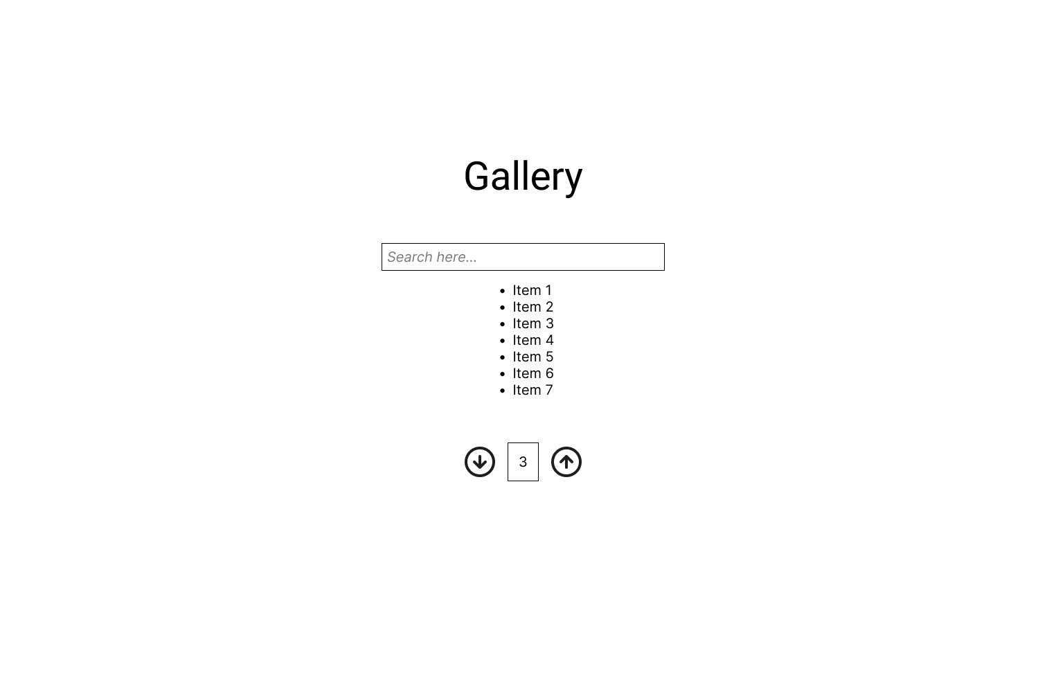
For this assignment, you'll be building a simple gallery app to display, filter, and paginate some data. By the end of this assignment, you should have a web app that looks like this.
Download the starter code here, and get your development environment ready.
- Donwload the starter code.
pnpm dlx degit cornell-dti/trends-mono-fa25/hw-3-starter a3 - Open the folder in your IDE. Make sure you open the directory right above
src. - Download dependencies.
pnpm install - Run the app locally.
pnpm run dev
In the source code of the assignment, you'll see some elements have the attribute data-testid. Don't delete these attributes; they are used for autograding.
Part 1: Paginator
Like we did in class, when we build a frontend, it's good practice to build bottom up. Start with each component in the app, then combine them together to get bigger and bigger components. We'll follow this approach by first building a Paginator component. Our gallery can display a lot of items, and we can't display it all at once. Instead, we use this paginator to split them into pages.
TODO 1
Currently, the paginator does not work. Navigate to src/components/Paginator.tsx. To resolve this issue, we first need to add reactive logic to the Paginator component.
Given the props that will be passed in to the client of this component, add logic to make the buttons update the page, while respecting the limits prescribed, i.e. the page displayed should always be in the range [minLimmit, maxLimit]. Assume as a precondition that minLimit <= page <= maxLimit. If minLimit is not defined, we assume it is 1.
Hint: To make a button do something on click, you need to attach a function to the onClick attribute of a <button>.
const callback = () => {
  console.log('I was clicked');
};

return <button onClick={callback}>Click me</button>;
TODO 2
The second step to fix this issue is to test it by rendering the component. In Gallery.tsx, render the <Paginator> as the last child of the outermost <div>, i.e. right before the last </div>. Pass in the proper props to the component to make the component reactive. If you implemented TODO 1 properly, your paginator should now work! You can hardcode maxLimit for now.
You'll notice that the state of Paginator is defined in a parent component. This is a powerful and common pattern since we need page to determine what data to display in Gallery.
Hint: We have defined a state page for you.
const [page, setPage] = useState(1);
Part 2: Gallery
Now that we have Paginator built, let's build the final Gallery. Our gallery will display data with at most itemsPerPage elements on each paginated page.
TODO 3
To support filtering our data, we have a search bar rendered on the webpage. How do we know the contents of <input> to filter our data? We need to control the search input. In React, a controlled input is one whose value is controlled by React state. Add some state and update <input>'s value to reflects the new state. When the user types into the input, the search state is updated.
Tip: A question you may have is how to verify that the state is being properly updated. As with any other CS class, print it out. For instance, create a button that, when clicked, logs the state. When you console.log anything, it appears in the console tab of your browser's dev tools. In many popular browsers, you can access the dev tools with the shortcut Cmd/Ctrl+Shift+C.
TODO 4
With your new state from TODO 3, we can now determine what items we can display.
The itemsToDisplay variable should be the list of items that should be displayed on the current page according to the following rules:
- It is size-limited to the itemsPerPage prop, since we don't want to display too many items at once.
- It is filtered by the search state, so that only items whose name contains the search query are displayed. When filtering, ignore upper/lowercase, and trim whitespace from either end of the search query as well as the item name.
- It is sliced according to the current page number. For example, if we are on page 2, and
itemsPerPageis 10, then we should display items 10-19.
TODO 5
Up to know, we have hardcoded maxLimit to our Paginator. Now we can derive this value as well. Define a variable called lastPossiblePage that should be the last possible page number that a user can go to according to the following rules:
- It is the smallest number such that
itemsToDisplayis non-empty. - It is at least 1.
Pass this value into the prop maxLimit.
TODO 6
Now that you have finished your Gallery component, let's test it out with some data. In data.ts we have defined a list of test data. Go into main.tsx and replace the props such that data is the list of dramas and itemsPerPage is some reasonable value, e.g. 10.
Congratulations! You have made a simple gallery view. Admire your creation.
Submission
Please submit to CMS your Paginator.tsx and Gallery.tsx file.